Save $59 with the 40% launch special
Normal course price: $149
Need help? Email hello@robhope.com
Chapter 13 of 22
Show Them with a how it works section
I’d argue that every Landing Page could be strengthened with a How It Works section. It’s incredible how a simple visual of numbered steps can help calm and educate your potential customer.
Inspiration
Good references
A collection of noteworthy visual references to spark ideas for your landing pages. Seen any other interesting ones? Let me know!
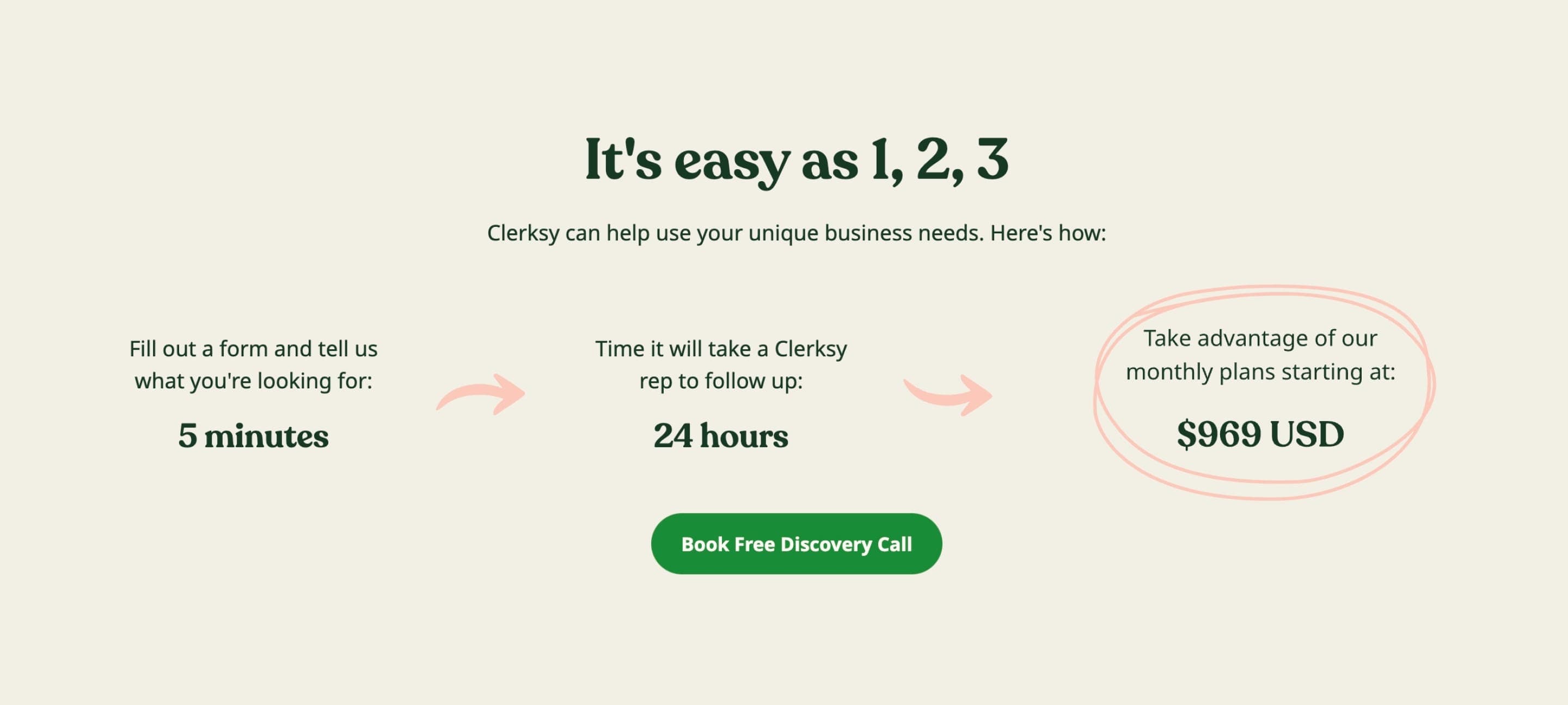
Clerksy - How It Works
Visit referenceA few elements to note here that give visitors peace of mind. The section title including the word “easy” along with a numbered 1-2-3, the bolded times per step and a price. Great to see a convenient CTA button below the steps.
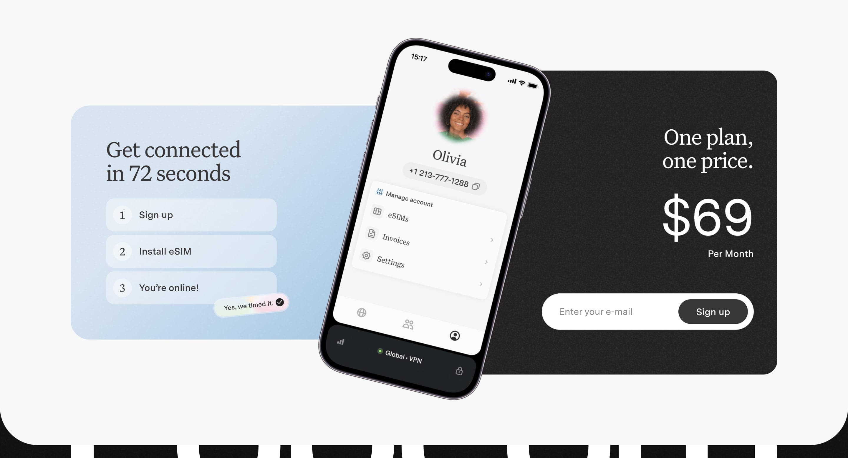
Popcorn - How It Works
Visit referencePopcorn integrate their minimal How It Works steps with a mobile preview and lead sign up. Note how specific they went with the time it takes to get connected.
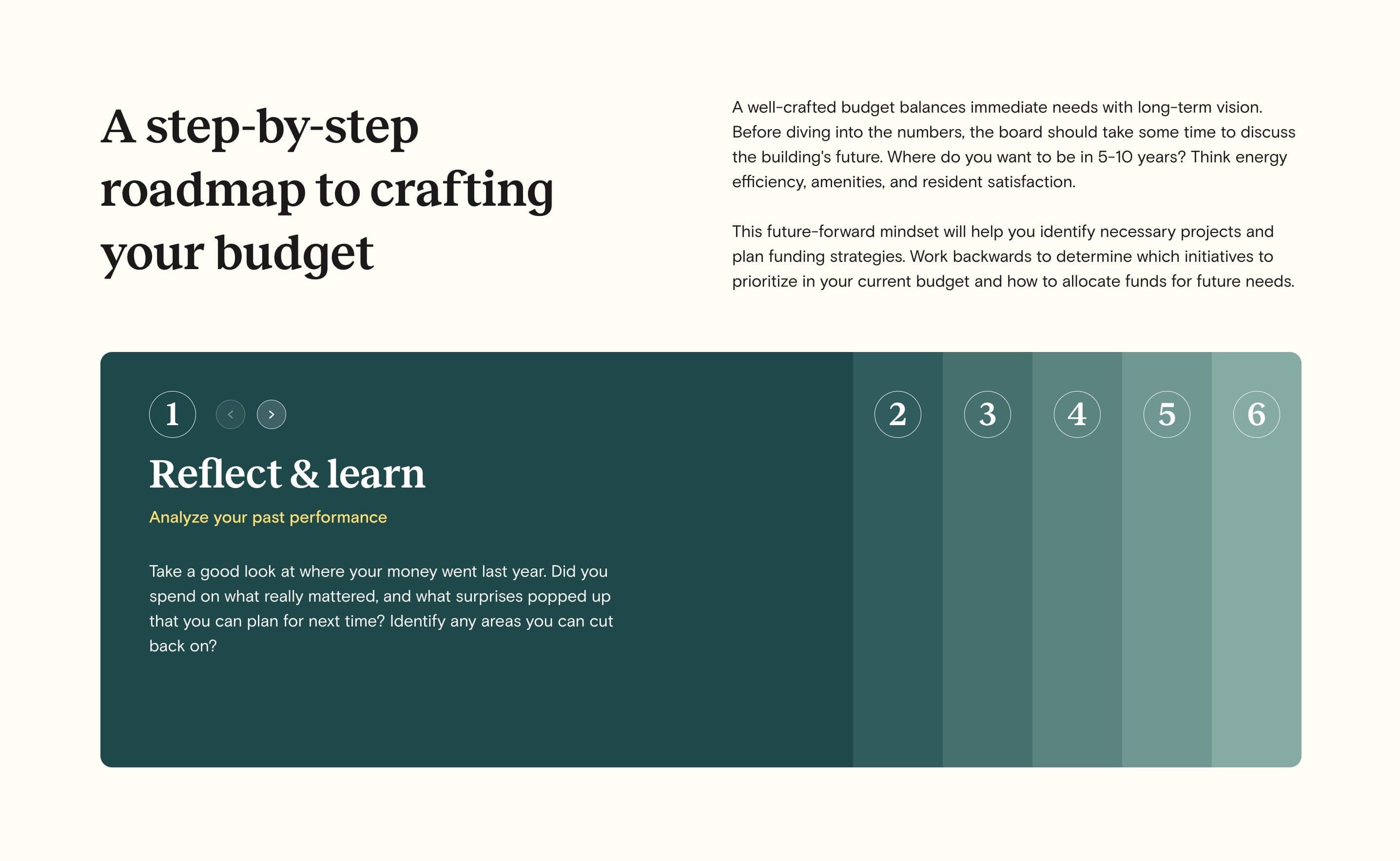
NYC OpEx Guide - How It Works
Visit referenceThe NYC condo & co-op budgeting guide How It Works section features an interactive horizontal accordion. There are clearly numbered steps and even arrows for added usability.
Docspo - How it Works
Visit referenceA simple looping arrow animation, along with a hand-drawn "replaces" note detailing what this step eliminates in your software stack, makes for a strong Docspo how it works section.
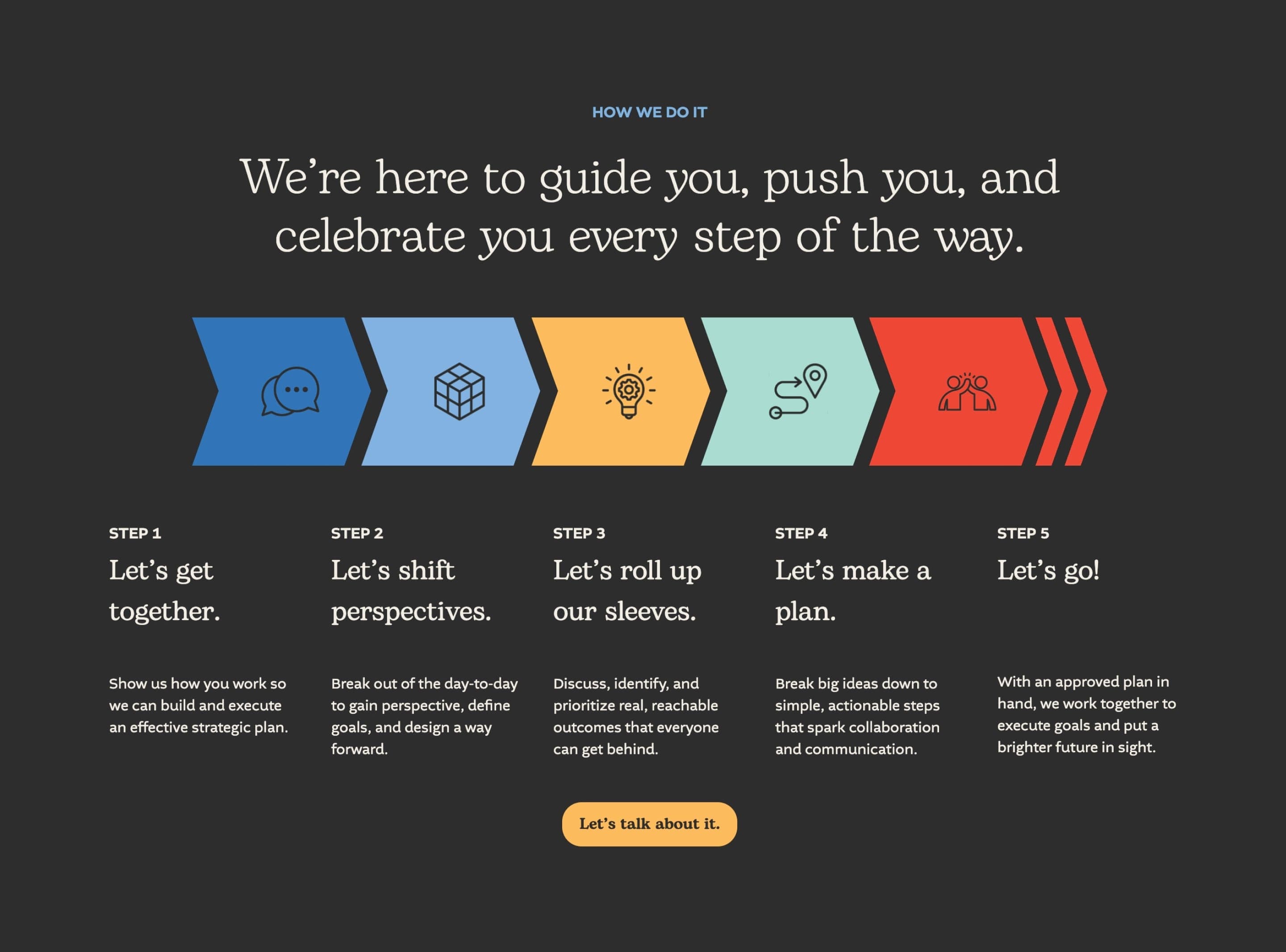
High Five Strategies - How It Works
Visit referenceThis How It Works section by High Five Strategies reuses the same 5-color pattern applied through the full Landing Page. Note the forward moving timeline illustration with icons aligned with steps.
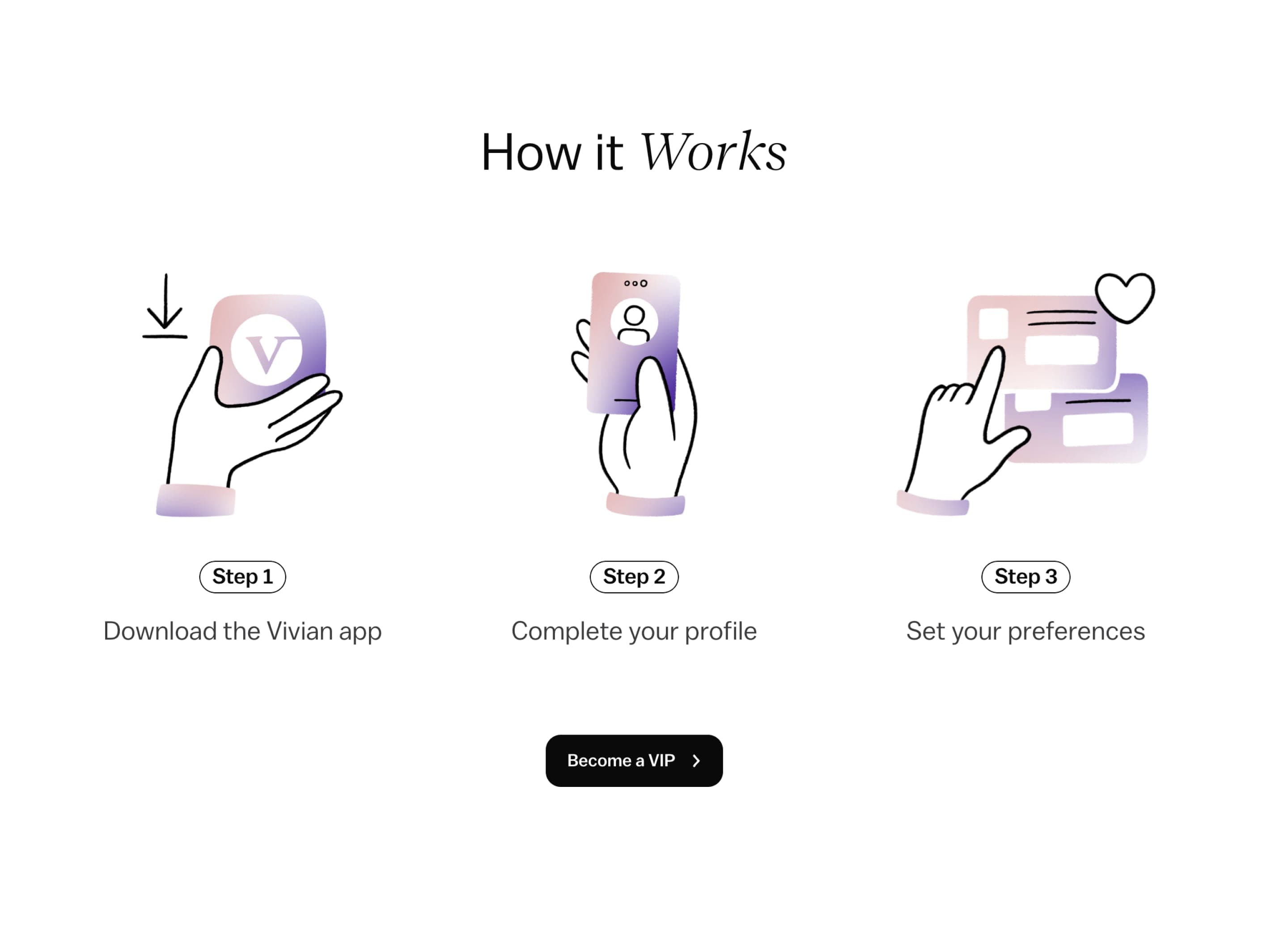
Vivian VIP - How It Works
Lovely custom illustrations in this simple yet elegant how it works section within the Landing Page promoting the VIP program for healthcare jobs marketplace Vivian Health
Useful
Resources
Links to external resources to help you dive deeper, find assets, or hire help to level up your landing page.